Roaring into year four of the license, Mcfarlane has been putting out fantastic figures in their tenure with the DC Multiverse license! It has sucked me in as a DC collector more than ever, and even helped propel me more and more into the pages of DC comics again! I've been very critical of Mattel before when comparing how they handled figures and character designs compared to how Mcfarlane is putting them out now, but even by the standards of when a lot of Mattel's figures were coming out they were already outdated, and it is an age old trial to compare the new to the old. So with Mcfarlane still pumping out designs that cover what Mattel gave us before, here is my 6th look at how both companies stack up against one another with 10 of Mattel's toys on the left and Mcfarlane's action figures on the right!
10. The Flash (CW)
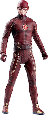
Starting off the list will be a figure I was wanting for a long time when Mcfarlane took over the license, and that was Grant Gustin's Flash based on the CW Flash television series! While the costumes that Mattel and Mcfarlane based their respective figures on are different costumes, the overall aesthetic is close enough for my to compare both attempts to capture this iteration of the Flash. I think both do a good job of capturing the colors and painted details of the costumes they're trying to take on; however, Mcfarlane far exceeds Mattel when it comes to articulation and the ability to pull off convincing running poses. Mcfarlane's also has a more recognizable Gustin facial appearance (along with the dreaded side eye many of the figures released around that time sported), not to mention a couple great lightning accessory pieces included those show specific to his ability to throw lightning!
9. Man-Bat
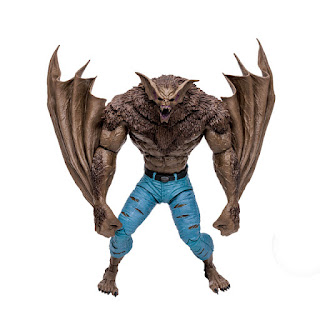
One of my favorite Mega Figures in the DC Multiverse line so far is definitely Man Bat, but Mattel's version on the left still has a lot going for it. The gangly proportions of Mattel's take is definitely a stark contrast to the hulking monster of Mcfarlane's, along with the ability to full splay his wings outward as if flying while Mcfarlane's are sculpting to be continuously clutched in the hands. Both do a great job when it comes to the sculpting, though I'm partial to the fur texture across Mcfarlane's, along with the darker and deeper paint scheme.
8. Lex Luthor (Rebirth Superman suit)
Looking back on this Lex Luthor from Mattel is looks a little wonky in the proportions department; however, was still packed with great sculpting detail and I think a lot of that black paint is what's missing from Mcfarlane's rendition. Overall though there's more sculpting detail to be gleamed from Mcfarlane's take on this design, and the headsculpt is one that I've felt has always been one of the best in the line and certainly captures Lex well (even with the annoying side eye).
7. Atrocitus
Mattel's Atrocitus still has a lot going for it between overall presence, menacing headsculpt, and inclusion of a power battery; however, I think it still falls short with Mcfarlane's increased articulation, size difference to the typical figures, and the texturing throughout the suit really makes it feel more real than the smooth plastic of Mattel's. Mattel's was definitely easily to get a hold of being a single release figure as opposed to Mcfarlane's being a build a figure, though for the quality of this Atrocitus I think it is well worth putting him together piece by piece.
6. Nekron
The final build a figure of Mattel's DC Universe Classics run was released a single mega fig in Mcfarlane's line of figures, shadowing the opposite of how both companies handled the previously mentioned Atrocitus. Nekron remains one of my favorite figures from Mattel's run with the license, sporting a wicked exposed heart and unique sculpting details, not to mention the real chains which are always 100% welcome over plastic chains. In the end though, it is definitely unseated by Mcfarlane's Nekron which explodes with the decrepit sculpting details that makes him look like the leader of the undead! A fierce headsculpt, gnarly skin with a tattered, textured robe, alongside his scythe accessory which was sorely missing from Mattel's product!
5. Robin (Tim Drake)
I wasn't expecting this design from Tim Drake when Mcfarlane revealed it, and really looking at the sculpt of the figure you can tell that this was intended overall to be for the red and green Tim Drake suit that was just revealed. But how does this pre-tool mold compare to what Mattel gave us in the past? I think both colors of the figures are on point, the sculpting of Mcfarlane's bo-staff accessory is a bit more compelling; however, Mattel's smoother sleeve sculpt and chest sculpt fit the costume more than the obvious cuffs and body design meant for Tim's red/green look. Articulation is still leagues ahead of what Mattel was doing, and there's more sculpted work than painted on details even with Mattel's Tim Drake sculpting more than their usual efforts.
It was no time at all before we got Kyle Rayner in my favorite design for the character, and I think Mcfarlane again has topped what came before. The increased articulation of Mcfarlane's version allows the figure to get into a lot of really dynamic poses, especially when applying the samurai energy constructs which are some of the funnest accessories in the line so far (and definitely beat the blast effect Mattel's came with). Mattel's comes with a nice lantern with Mcfarlane had already put out with Kyle's Blackest Night figure. Both chest emblems are painted well on both figures; however, the texture of Mcfarlane's (which I loved) does make the white paint bleed a bit into black. The only other point of comparison I'll make is the difference in greens, with Mcfarlane's skewing a bit closer to what I feel matches the comics more, though a happy medium between the two would be perfect.
3. Kid Flash (Wallace West)
As with all speedsters, Mcfarlane's easily tops it in the articulation department and being able to pull off a normal natural running pose, even with Mattel starting to add increased articulation by the time they release their Wallace West. The sculpted chest emblem will always win for me compared to Mattel always painting theirs own, though I do have to say that their painted zig zag applications for the wrists and ankles are more cleanly applied when you really start to look at Mcfarlane's (a little fuzzy and sloppy). Wallace's size in the Mattel line I think work better, as Mcfarlane's is just a little too tall; however, Mcfarlane's headsculpt for the character I think matches the source material much more closely and looks less like a plastic toy (even if that's what it is).
2. Scarecrow (Batman Begins)


One of my favorite figures out of the new Dark Knight Trilogy assortment from Mcfarlane is the Scarecrow, sporting a very short lived design in the movie itself but one that both Mcfarlane and Mattel recreated for their action figure toylines! I remember really liking Mattel's Scarecrow when it first came out, and it was a lot of impressive sculpting when it comes to the worn look of the straight jacket, and the really awesome burlap sack headsculpt! Mcfarlane's articulation is top notch, and the suited portion beneath the straight jacket is more well down as well as includes the front flaps of the suit jacket which Mattel's omitted. The dirty paint applications on Mcfarlane's really help bring the details out in Mcfarlane's version which I would say accomplishes the straight jacket sculpt on a whole other level. Mcfarlane tried to do something neat with the headsculpt by including what seems to be maggots; however, the paint feels like it gets a little sloppy around the cranial area so I'd have to give the headsculpt winner to Mattel's.
1. Two Face (The Dark Knight)
Two Face from Mcfarlane's Dark Knight Trilogy wave is my least favorite of the assortment; however, I think it is still miles ahead of what Mattel gave us back in the day. Mattel's reused a lot of the same stiff suit sculpt they gave a lot of suited characters, resulting in very squared off legs and arms with minimal articulation, though I do like the sculpting of his burnt face a lot. Mcfarlane's is an easy winner in the articulation department, along with the overall silhouette looking a lot more natural and human. Mattel's tie oddly includes inaccurate blue stripes, and Mcfarlane's gain another hoop above it for the inclusion of a hand holding the two sided coin!


Comments
Post a Comment